
NUI#13 - Project Qaafi
On Soap Shastri, "Zyaada nahi", and the Indian beauty brand being built from the outside in


We’re pumped to hand over the reigns of this week's edition of Next Up India to Fatema Raja - creative strategist, brand builder, and the voice behind LAYER BY LAYER. She's spent a decade shaping brand and design systems at Gojek, Swiggy, and PhonePe; was part of the Sephora Accelerate cohort of 2025; and hosts Acid Sisters, a monthly podcast celebrating women on unconventional career paths. We hope you enjoy her musings as much as we did - over to Fatema👇
There is a small green tube that has sat, largely unchanged, in Indian bathrooms since 1929.

Boroline.
You know it. Your grandmother knew it. It didn’t need a seven-step ritual or an ingredient list engineered for a Nykaa algorithm. It was squat, authoritative, and completely sure of itself - in its own way, a piece of genuinely original Indian design. It was also, at the time, an act of political defiance dressed up as a tube of cream.
Gourmohan Datta founded his company at the height of the Swadeshi movement. He was a Bengali merchant who had previously dealt in imported cosmetics. The hero product of his new venture - Boroline - was an antiseptic concoction that smelled faintly of hospitals and worked on everything from cracked heels to cuts. It was a homegrown answer to the imported foreign creams that had spent decades teaching the Indian consumer that good things could only come from somewhere else. Boroline was a refusal. A small, green, 20-gram refusal.
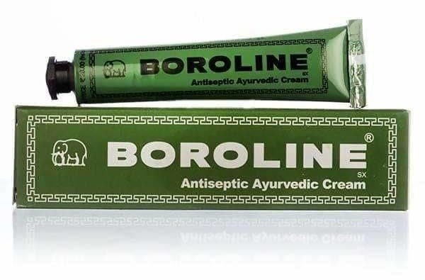
That assuredness extended to the packaging, which also had something to say. The iconic elephant on the tube wasn’t some throwaway decorative choice. It was what polished venture studios might describe today as a considered design decision, chosen for its association with Ganpati and its legibility to a largely non-literate rural consumer who needed to identify the product without reading the label. It worked so well that most of India never called it Boroline at all. They called it hathiwala cream. The design had done its job so thoroughly it threatened to replace the name entirely.
This was not a one-off. Across Indian commercial life in this period, entrepreneurs were beginning to ask a question that seems obvious in retrospect but was radical at the time - what would it look like to build for India, from India, without asking anyone else’s permission?
Those answers have taken a variety of colourful forms. The earliest ones are over a hundred years old. The latest one is the reason you’re reading this - it’s the subject of today’s piece. But to properly appreciate what’s being built in 2026, you need to understand the lineage it’s being built on. And for that, we need to take a brief historical detour, back to 1916.
Origins
In the early 20th century, World War One had resulted in a blockade of global shipping routes. This meant the Kingdom of Mysore had suddenly found itself sitting on a sandalwood surplus it couldn’t export. The Maharaja Nalwadi Krishnaraja Wadiyar and his Diwan Sir M. Visvesvaraya made a decision that today seems remarkable in both its ambition and foresight.
Rather than wait for the war to end, they elected to build a soap industry for India from scratch. This was not a small thing to attempt. The Indian soap market at the time ran almost entirely on Lever Brothers' Lifebuoy, a British import that had spent decades making itself at home in Indian bathrooms. A homegrown alternative simply didn't exist. To do this, the monarch and his moderniser decided to send a chemist from the Indian Institute of Science, S.G. Shastri, all the way to England to learn the craft of soap-making.
He did, and eventually returned, knowledge in hand, and got to work setting up the Government Soap Factory at K.R. Circle in Bangalore.

The factory building went up in 1917, its equipment shipped in from George Scott & Sons in England. It took another year of experiments before Shastri was satisfied enough to release the soap to market. When it finally went out in 1918, each box carried a line of Kannada script: Srigandhada Tavarininda. ‘From the home of sandalwood’.
Shastri designed the packaging himself, a rectangular box modelled on a jewellery case, because he believed a soap made from pure Mysore sandalwood deserved to be presented like a jewel. That instinct, that the packaging should honour what it carries, was an idea ahead of its time (and an idea I often return to). People loved what he built so much they started calling him Soap Shastri.

The strongest testament to his work is that it endured. Over a hundred years later, Mysore Sandal Soap is still the only soap in the world made from 100% pure sandalwood oil, protected by a geographical indication tag that no other manufacturer can touch. India had outsmarted a global supply crisis and, in the process, turned a wartime inconvenience into an institution.
Another pioneer would follow half a century later.
In 1969 Dr. VP Sidhan was a Railways doctor in Chennai who watched sanitation workers show up every day with skin that conventional medicine couldn’t fix. He formulated a soap from 18 herbs in his kitchen, and sold it through pharmacies as a prescription product. The jade green bar with its red-and-black packaging looked like nothing else in the Ayurvedic space at the time.
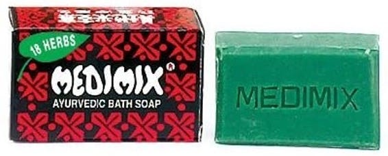
Every other product in the category reached for earth tones and temple imagery. Medimix looked like a prescription, because it was one. The packaging told the truth about what it was, and that turned out to be exactly what made it work. By 1975, the brand was embedded enough in South Indian life that K. Balachander - directing Rajinikanth’s debut film Apoorva Raagangal - made the lead female character a Medimix salesperson. He would later claim that he had introduced two superstars through that film.

In any case, by the 1970s that combination of colours and that name - Medimix - had become instantly recognisable on the radio and billboards across South India. HUL came knocking in the mid-1990s with an acquisition offer. The family said no. When asked why they turned HUL down, they didn't cite valuation or legacy. They said HUL didn't understand Ayurveda, and as a result, had no business making something they didn't understand. Full stop.
Today Medimix is India’s largest-selling handmade soap, made without a single unit of electricity, stirred in stainless steel cauldrons over eight days, by a workforce that is more than 60% women. It now exports to over 30 countries, which means the soap Dr Sidhan made in his kitchen for railway workers in Chennai is sitting in bathrooms in Ghana and Canada.
The point of both these stories isn’t really the products.
It’s that the people who built them never stopped to wonder whether what they were making was the right kind of thing to be making. Soap Shastri didn’t ask whether sandalwood was a credible ingredient. Dr Sidhan didn’t ask whether a prescription soap sold through pharmacies was a viable business model. They read their own context, trusted what they found there, and built accordingly. The confidence was total, and it showed up everywhere - in the decisions they made, in the materials they chose, and eventually, in what the things they made looked like.
The rectangular box and the jade bar had a personality and a ‘visual language’ of their own. And those two objects were not exceptions either. They were symptoms of something much wider.
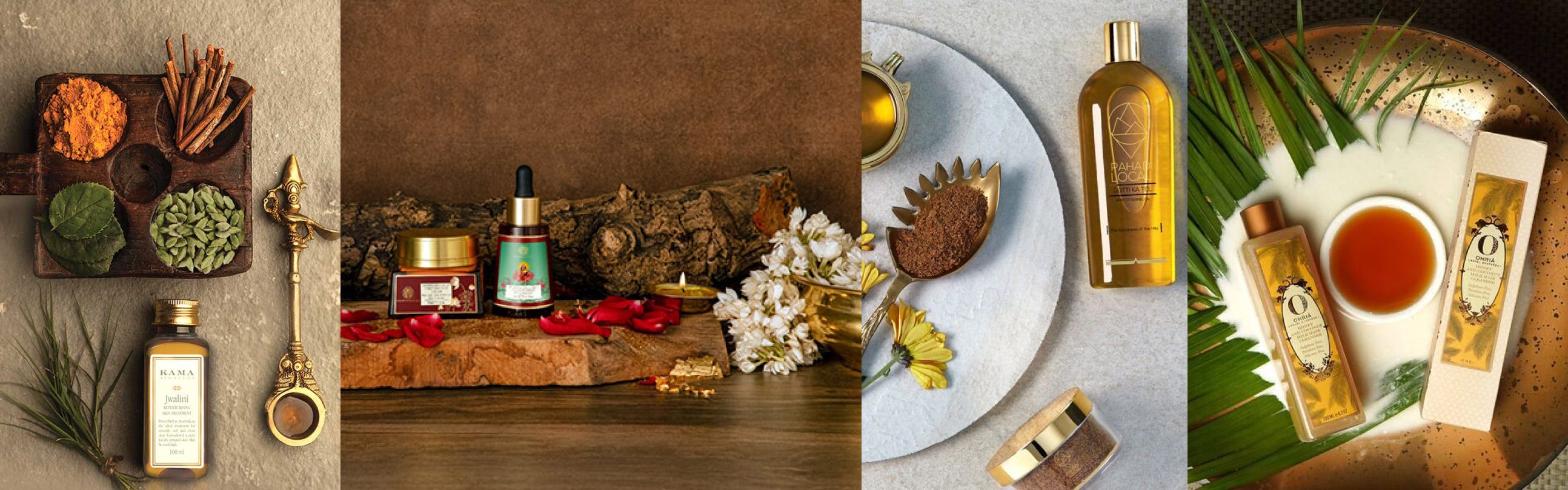
Before the internet convinced Indian brands to aspire towards Scandinavian whitespace, before “clean beauty” meant sans-serif and a pastel tube, India had a visual tradition that was completely its own. You'd find it on a tin of Dabur Chyawanprash. On a Parle-G wrapper. On the label of a Chandrika soap bar sitting by someone's kitchen sink.
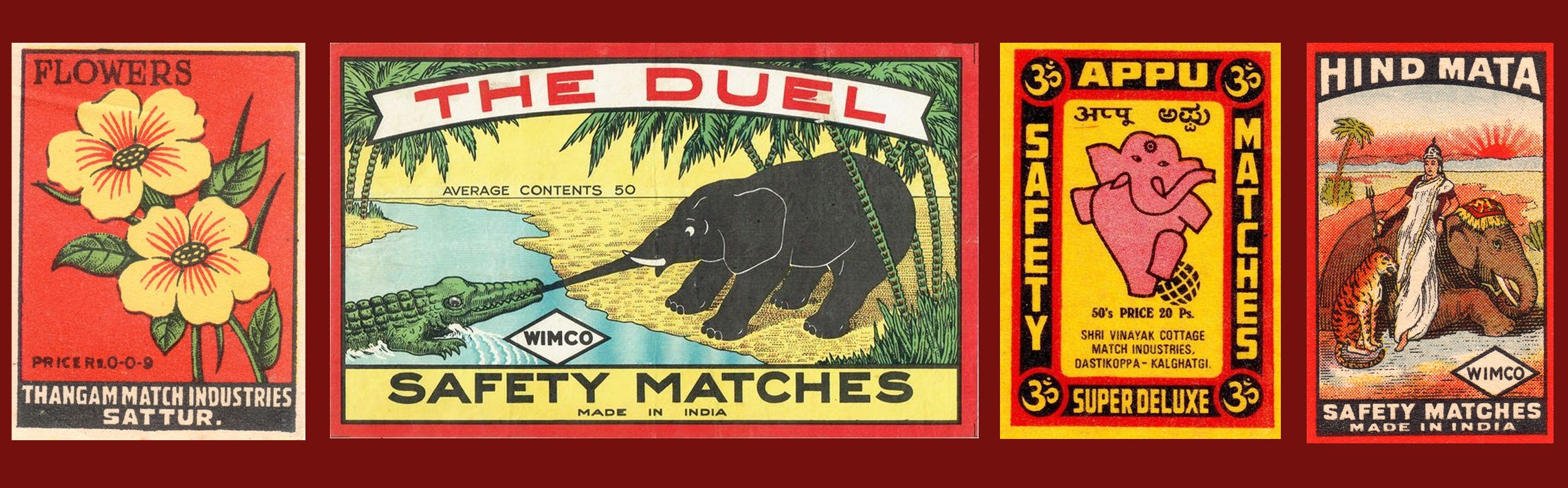
The Rasna sachet. The Camlin ink bottle. The Nycil powder box. These were objects with a specific identity that could only have come from here - built for a particular kind of Indian consumer, speaking to her directly, without translation or apology. Nobody sat down and called it design. It was just what things looked like when a market was building for itself and had no reason to look over its shoulder.
But that assurance turned out to have a timestamp on it.

1991 brought a lot of things India genuinely needed. Competition. Capital. Choice. Also, McDonalds.
But it also brought a new hierarchy of taste. In that hierarchy, foreign meant better almost by default. Western aesthetics became shorthand for quality before anyone had stopped to ask whether that was actually true. And the Indian beauty aisle, which had spent decades building something of its own, sheepishly started looking elsewhere for instruction.
Over the next three decades, that instruction kept on reinforcing itself. The whole category went from absorbing foreign influence to organising itself around it. Eventually, two lanes emerged, and every brand picked one.
The first lane looks Westward. Scandi minimalism, Korean clinical cool, French pharmacy palettes. The formulations are often genuinely good. But visually, it’s a copy-paste job. No origin story. No reason it couldn’t have been made in Rotterdam.
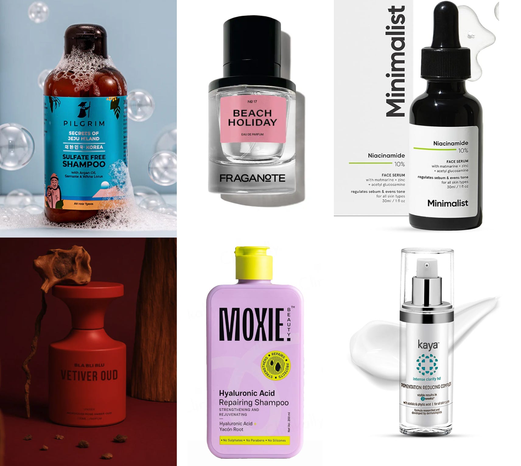
The second lane is the one I find harder to sit with, what I’d call the Ayurveda-industrial complex. Kansa guashas hand-welded by artisans near Jaipur. Oils passed down five generations. An apsara in a forest. A baba under a tree. Basically, a travel poster version of India, one that reaches for heritage as an aesthetic rather than an identity, and ends up flattering a certain kind of international buyer far more than it represents the place itself.
Both lanes work, and I understand why. One sells aspiration, one sells heritage, and both have found real audiences. But neither is saying something honest about 2026 India, a country that is simultaneously rooted and completely contemporary, which, when you sit with it for a moment, is a far more interesting story than either of those.
Here’s what makes that particularly strange for me. We’re in the middle of what is genuinely India’s second Swadeshi moment. The D2C wave has produced real brands, real founders, real investment, real exits. But when I look at the design, the packaging, the typography, the visual identity of most of these brands, I see the colonial hangover running deep. The design still gazes westward. The commercial ambition is there. What hasn't followed is the confidence that Soap Shastri packed into that jewellery box.
…which brings us to Project Qaafi.
What is it?
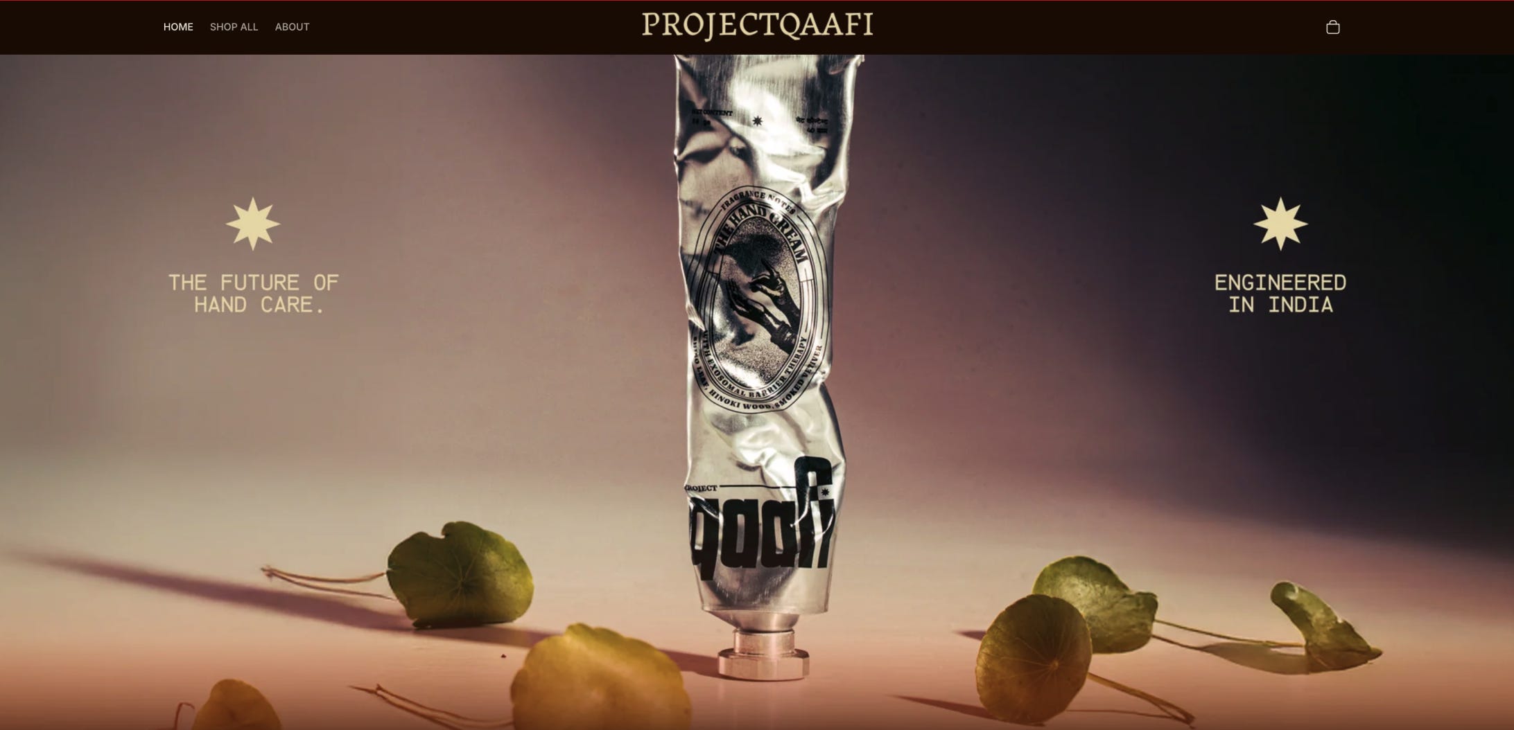
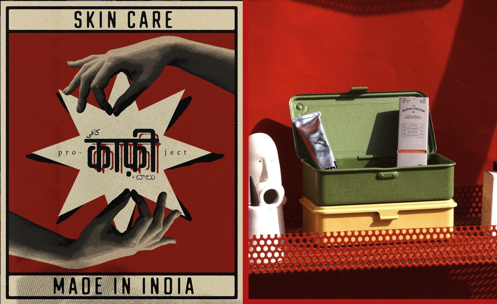
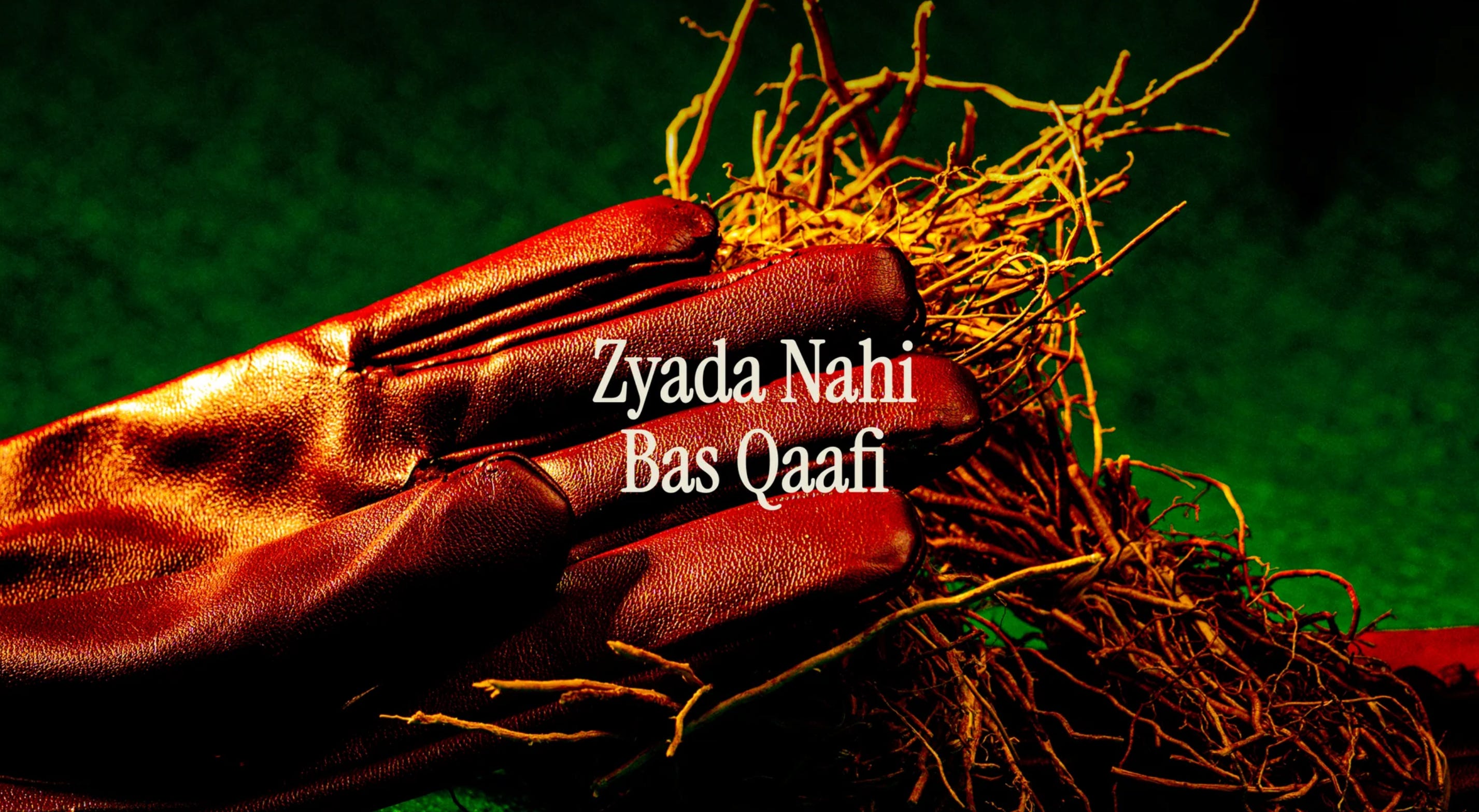
Project Qaafi is a design-led beauty and personal care (BPC) brand from Mumbai, founded in 2024. The name comes from a colloquial Hindi phrase, zyaada nahi, bas qaafi. Not too much, not too little. Just enough.
It’s a deceptively simple founding principle, and for a branding nerd like me, one that is refreshingly uncommon. When Aahan Chatterjee was naming the brand, he wasn’t reaching for something that sounded aspirational or loud. He wanted a name that reflected the brand’s way of thinking, which, in a category that routinely promises to change your life with a single serum, is its own kind of statement. The wellness industry has spent the last decade training us to expect the miraculous, and most brands have happily obliged. Qaafi looked at that arms race and opted out.
The old saying has it that necessity is the mother of invention. Qaafi makes the case for ‘restraint’, which when done right is its own form of sophistication. Zyaada nahi. Bas qaafi.
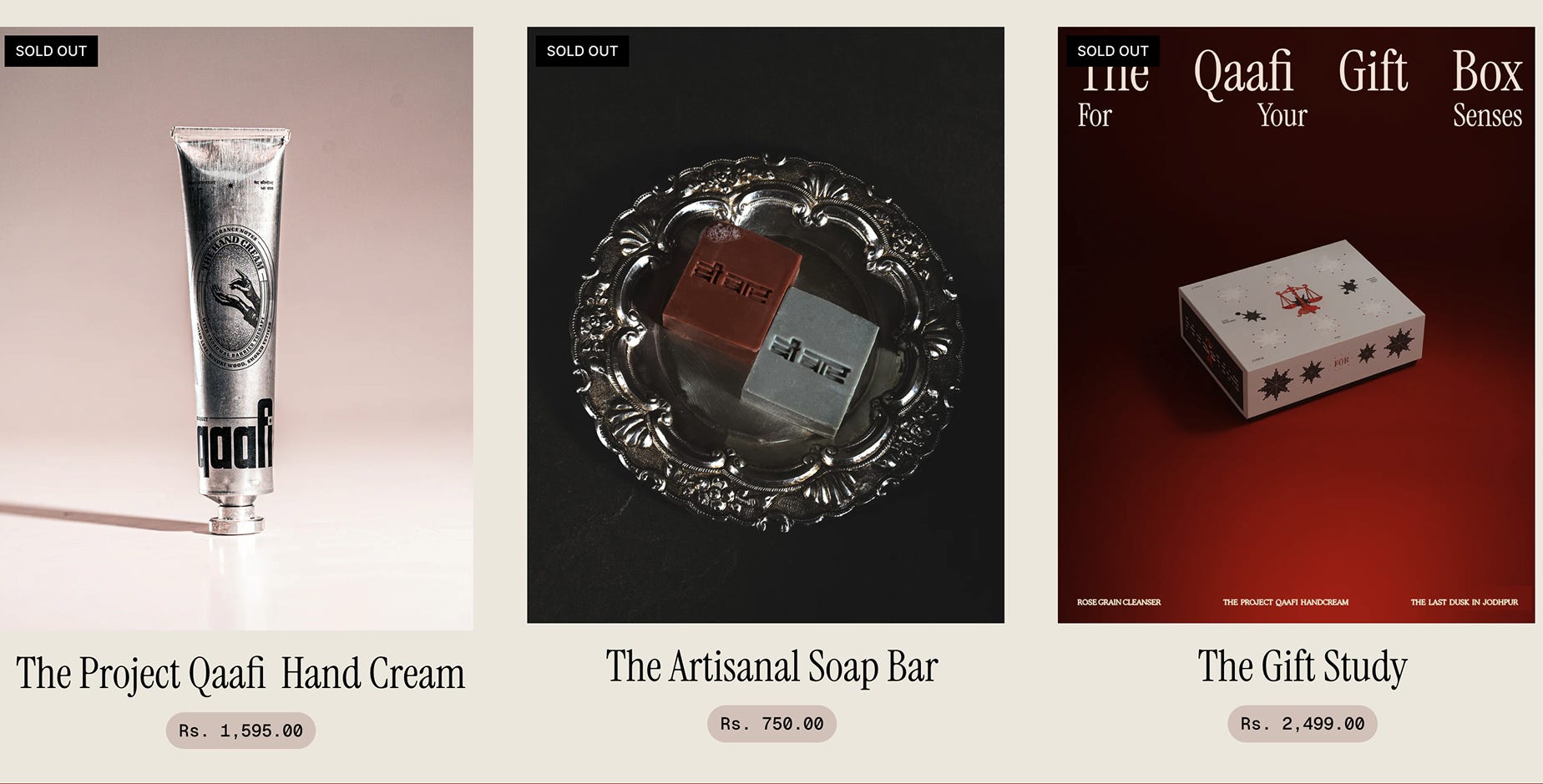
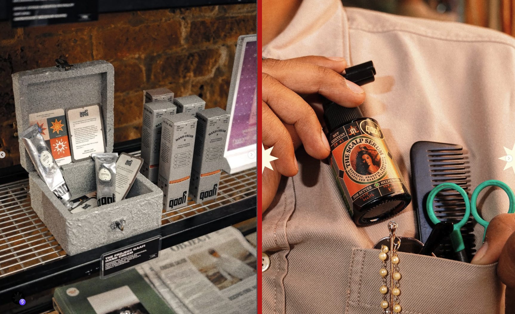
The brand’s debut collection is called Qaafi Ignored. The collection includes a scalp serum and a hand cream, which is not what any corporate-approved launch playbook would recommend. That is, most new BPC brands tend to announce their arrival with The Face.
Why? Because that is where the attention lives, and where the attention lives, money tends to co-inhabit. Qaafi instead went straight to the parts of the body that skincare has spent years treating as secondary. The scalp, which most of us only notice when something goes wrong, and the hands, which are the most used and least celebrated part of the body. Qaafi decided that these were exactly the places worth starting, and in doing so, made it clear that its originality goes all the way down to product development, and what they believe is worth making in the first place.
Who founded it?
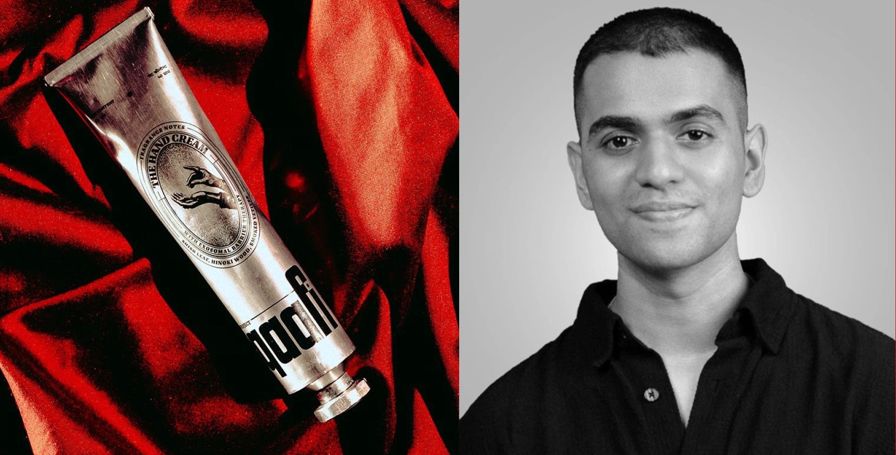
Aahan Chatterjee is 25. He grew up watching his family work in FMCG for two decades, the kind of proximity that teaches you things no classroom does about how brands in India get built, scaled, and more pointedly, where they often lose the plot.
He studied marketing at NMIMS, completed a programme at the Indian School of Business, and worked on the agency side at Sociowash, Landor & Fitch, and Schbang. Those three stops gave him a thorough education in how Indian brands communicate, and an uncomfortable front-row seat to how most of them end up - slowly flattened into sameness by the logic of mass-market distribution.
That was his starting point.
Aahan is not a chemist who decided to start a brand. He is not a wellness influencer with a white-label manufacturer. He is a designer and brand builder who started a beauty company because he found the category aesthetically indefensible and decided to do something about it.
In my professional adventures, I frequently encounter this persistent and insulting narrative that Indian founders are good at operations and engineering but not at nurturing taste and expressing their cultural vision. Qaafi is a direct argument against that. The interactions are considered. The formulations are rigorous - exosomes, peptides, ceramides, niacinamide, a full stack of actives - but they are a consequence of a design-first vision, not the premise of it. In other words, Aahan started with a design philosophy and worked backwards, making sure what was inside the tube was actually worthy of what was outside it. The brand is really answering one question: what does a contemporary Indian beauty brand look like if you build it entirely from first principles, borrowing nothing and apologising for nothing?
Less than a year after launching, Qaafi was named a finalist for the Estée Lauder Companies' Beauty&You Awards in partnership with Nykaa, one of the most credible external validations a new Indian beauty brand can get. The press followed: Elle, HomeGrown, Grazia. The Kyoorius Design Awards recognised it. For a brand barely a year old, sure, the coverage is great validation. But the more telling signal is where the product has ended up - on the shelves of the country's most design-conscious independent retail spaces, chosen by the kind of buyers who don't stock things out of politeness.
Where can I find it?
You can order directly from projectqaafi.com, which is worth visiting just to look at even if you’re not buying immediately.
If you'd rather hold it before you commit, that's worth doing with this one. The object has a physicality that doesn't come through on a screen. Qaafi is stocked at General Items, Capsul, Shuffling Suitcases, Subko and Dhora Mumbai.
This list is not accidental either. These are independent, design-conscious spaces where the kind of person who would appreciate what Qaafi is doing is already spending their time. The brand has put itself in the right rooms, and at this stage, that says almost as much as the product itself.
(Fair) Price?
The Project Qaafi Hand Cream, their flagship product, retails at ₹1,595.
That’s roughly what you’d spend on a mid-range imported hand cream at a duty-free, except nobody at a duty-free is actually thinking carefully about what they’re buying. That’s rather the point. Aahan has said himself that pricing a hand cream as a considered purchase is a slightly absurd decision. I think it’s exactly the right one. The design, the result-oriented formulation, and the quantity you get all sit correctly at that price point. My product has lasted over three months, which is value for money for a hand cream used daily and passed around often.
The Anatomy of Project Qaafi
On Product Design
When I pick up the Qaafi tube, the first thing I notice is the weight. Not metaphorically but literally. It feels different from everything else on the shelf.
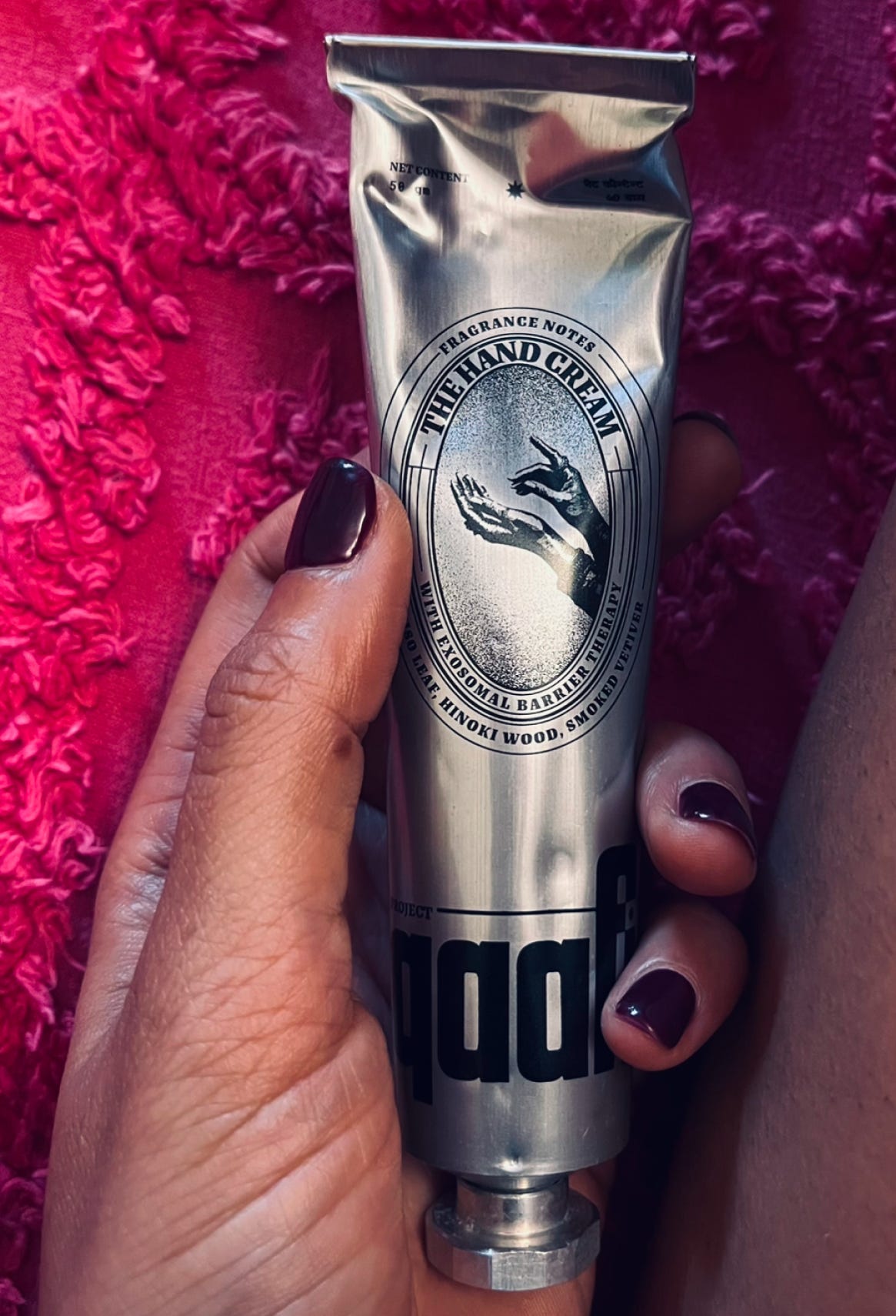
The aluminium has a coolness to it, a density that most skincare packaging has been deliberately engineered to avoid, because light and airy is supposed to feel premium. Qaafi’s design is industrial, almost archival, like something you would find at the back of an old apothecary.
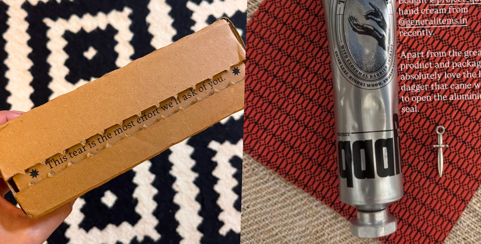
Nothing about this object lets you rush through it. The packaging comes with a tiny sword-shaped pin to pierce the tube seal, a detail that nobody asked for but one that made me put everything else down. That is what good design does. It finds the moments you would never have thought to notice and makes them impossible to forget. The sword pin is a perfect example of this - it transforms something as mundane as opening a tube into a small ceremony. It would be gaudy to rush a ceremony.
The tube is also calibrated to dispense exactly what you need, nothing more, a nod to the brand’s founding philosophy. Hidden inside the ingredient list is a secret code, a small reward - one I found charming - for whoever reads labels all the way through.
Admittedly, there was one suggested change I had for the Qaafi team based on my first time use of the product. It was about the cap, which felt more aesthetic than functional, and more designed to be looked at than opened and closed fifty times a day. When I met Aahan in person, he told me the same feedback had come from almost everyone who loved the product. They’ve already incorporated that change for the next production round.
On Visual Design
This is my favourite part. As a designer, the first thing I look at is what a brand chooses to leave out. Qaafi’s brand mark is an oval medallion pressed into the centre of the tube with a bold lowercase qaafi sitting at the bottom, and what got me nodding was the negative space between the two. The empty space that most brands would have filled with something, a claim, a badge, a decorative element, anything to justify its existence - Qaafi just left it as is. In my experience, the confidence in knowing exactly when to stop is where ‘taste’ usually lives.
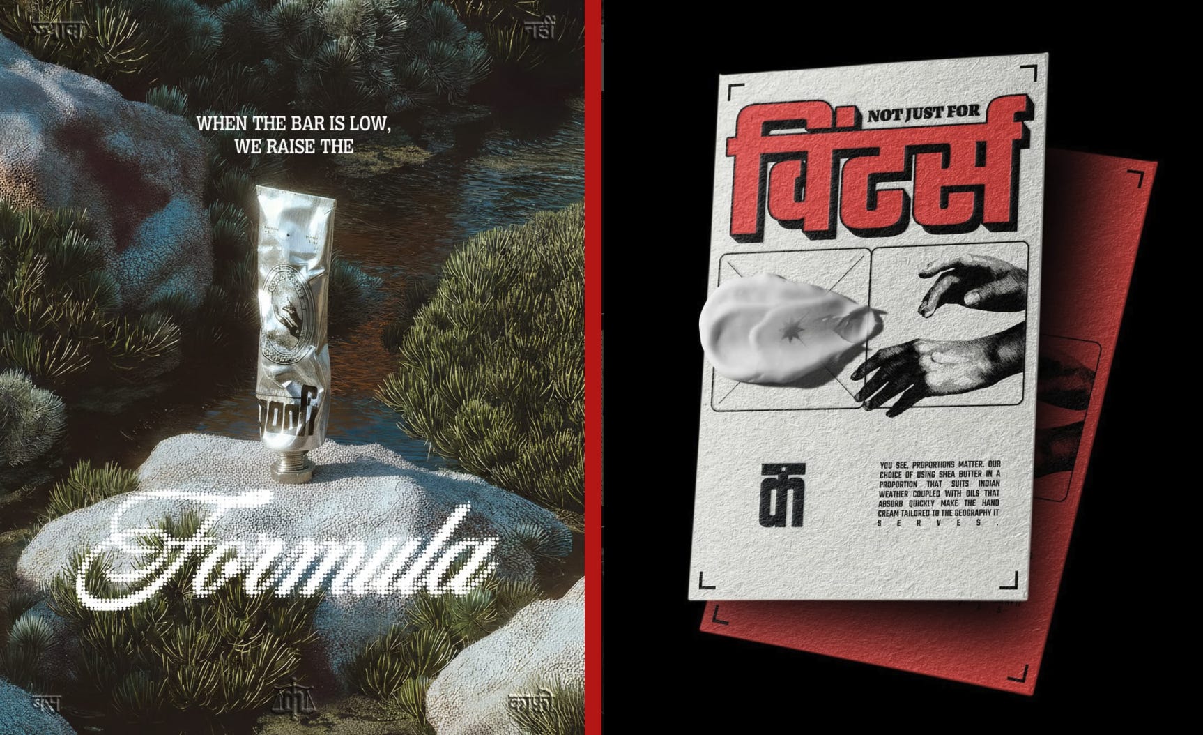
When it comes to typography, most brands, when they want to signal Indian roots, reach for Devanagari. Drop a word on the label, call it a cultural identity, move on. Qaafi takes the geometry of Indian scripts and works it into the letterforms without making it obvious. It's the difference between wearing a costume and actually having a point of view.
I give extra marks to the colour palette - industrial greys, forest greens, desi reds. I wouldn’t have put those together myself, and I know how hard that combination is to actually pull off. It’s brutalist and warm at the same time. It really shouldn’t work. But I love that it does.
On the whole, what I admire about Qaafi’s design philosophy is that none of it defaults to a gender. There is no softness coded for women, no charcoal aggression coded for men. This matters more than it might appear, because the temptation in a category like BPC is to use gender as a shortcut. It gives you an instant visual brief. It tells you which type family to reach for, which palette, which texture, which photography style. Qaafi throws that shortcut out entirely and is building a visual language that holds its own authority without leaning on any of the gender codes.
Good design has always worked this way. The most enduring work coming out of the Fortune 500, the objects that have genuinely lasted, is never good design for a demographic. It is just good design, period. For a market that has spent decades telling people which shelf they belong on, Qaafi’s stance is harder and braver than it might first appear.
On Product Formulation and Texture
I’m the person who pulls out a hand cream at a dinner table and passes it around. It is a non-negotiable for me, something that lives in every bag I own. Most people don't think about their hands until something goes wrong, but they should.
PSA: Your hands are underserved. Think about what they go through in a single day. Every surface they touch, every round of washing, every hour under air conditioning. The skin is thinner there than almost anywhere else on your body, and under more mechanical stress too.
It's the dry knuckles in winter. The tight, stripped feeling after too much sanitiser. The generalised roughness that builds so gradually you stop noticing it until one day you really do. Dermatologists actually have a name for what's happening underneath - transepidermal water loss, where a compromised skin barrier loses moisture faster than it can hold onto it. It is damage accumulated.
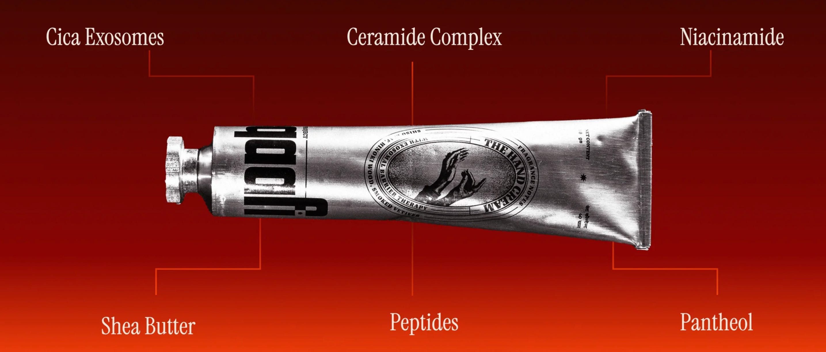
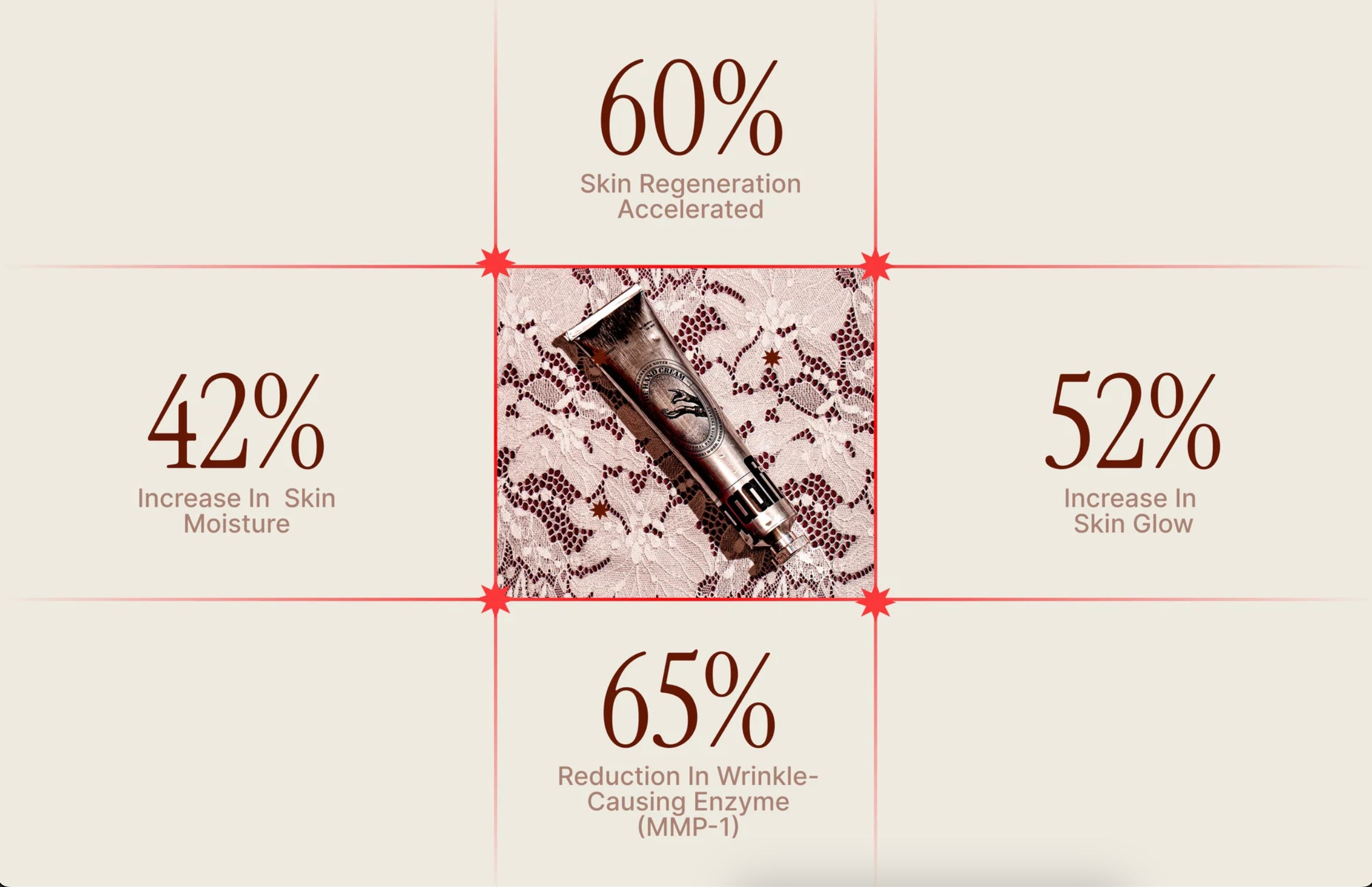
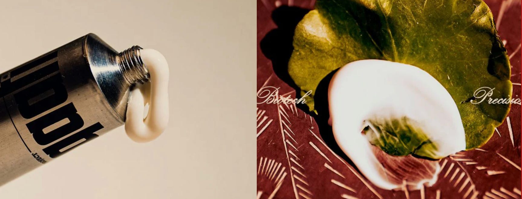
Qaafi’s hand cream is built to actually address this. The formulation carries a full ceramide complex, peptides, niacinamide, cica exosomes, and d-panthenol, a set of actives working at a cellular level to repair the skin barrier and restore moisture. The absorption is clean, the finish isn’t waxy, and the results are the kind you notice only when you stop using something, which is the most honest measure of whether a product is actually working.
For a long time, the quest to find ‘a product that actually works’ meant defaulting to imported options. Not out of snobbery, but out of a genuine absence of Indian alternatives. Qaafi is the first Indian brand I’ve reached for in that slot and not wanted to replace.
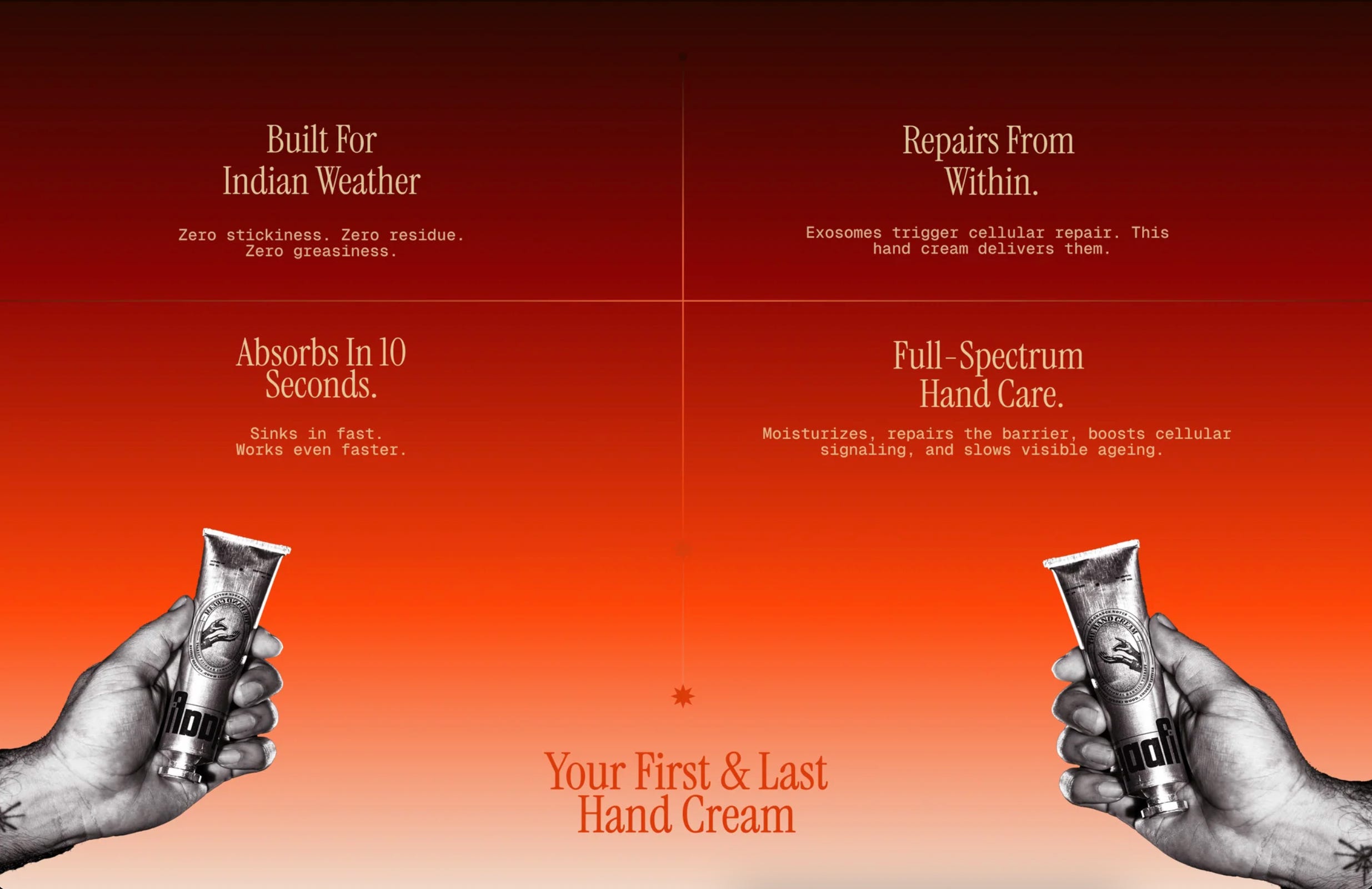
Hand care has always been treated as indulgence, a gift item, a nice-to-have. It's one of the few essentials that most routines are missing, even routines that have everything else. Qaafi made that argument easier to make.
I have long nurtured a considered hierarchy of what belongs in my bag, on my desk, by my sink. Qaafi has earned a place in all three. As much as I love the texture and formulation, what makes me reach for it every single time is the design. A beautiful object gets used. A beautiful object gets carried around and shown to people and talked about. The tube is a conversation starter, and for a brand this early, that is a big signal.
Bonus: On Brand Collaboration
The brands a company chooses to collaborate with tell you more about it than any campaign will. Why? Because seeding a creator is often viewed as a transaction, but a genuine collaboration with another brand makes a definitive statement. And the most interesting collaborations are rarely the obvious ones - it’s two brands from entirely different worlds making something together that neither could have made alone.
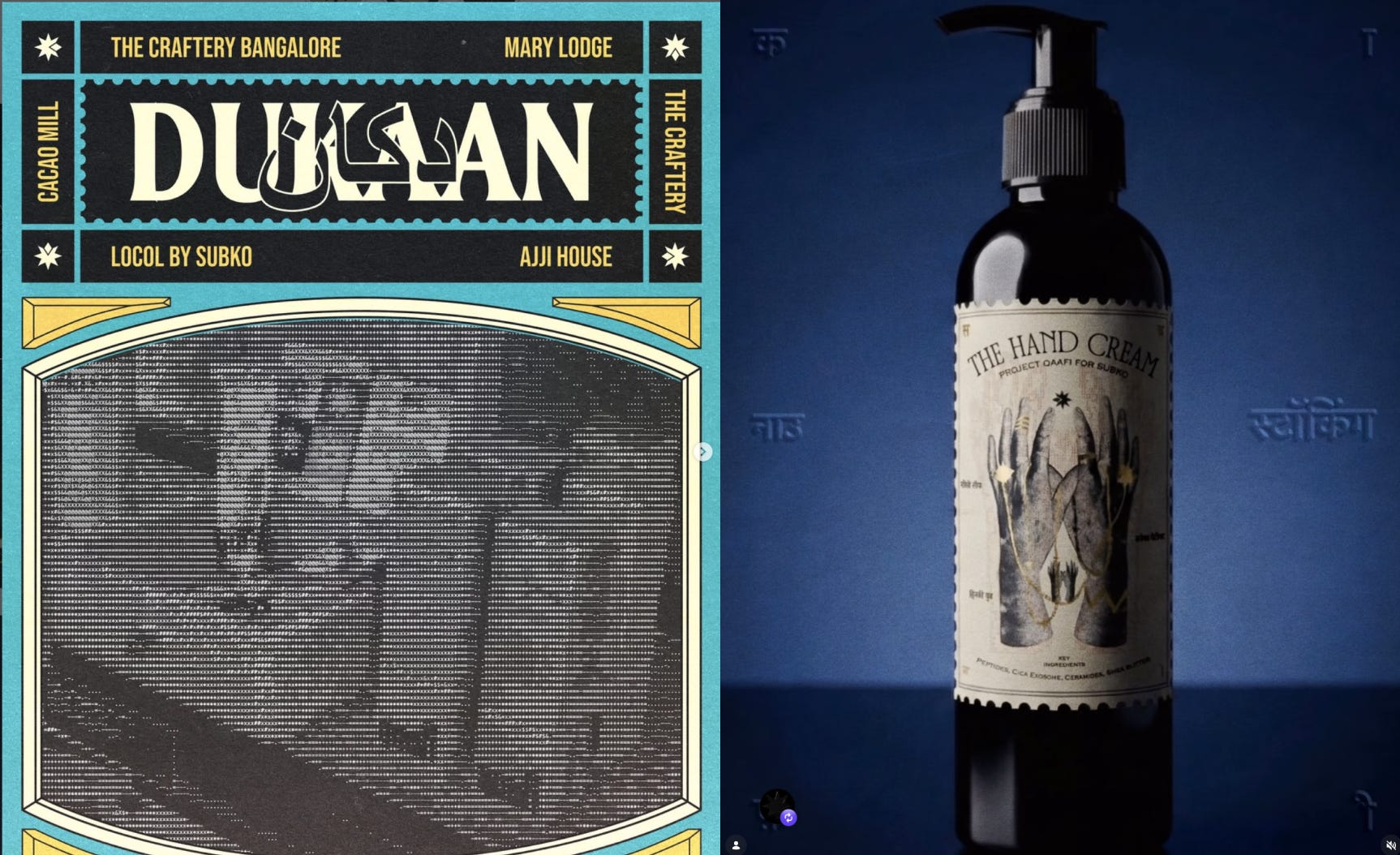
Qaafi has been savvy at playing this game. Their Subko collaboration is the best example. On paper, a specialty coffee roaster and a skincare brand have no business making something together. Like, why would a specialty coffee roaster provide shelf space for a hand cream brand at their store?
Well, spend five minutes with either brand and the connection is obvious. India’s most design-serious coffee roasters and India’s most design-serious BPC brand, finding each other not through a shared marketing strategy but through a shared point of view. As Aahan admits - "I have gotten feedback that our design is a bit similar, so I'm trying to make sure it feels different, because we're in a different category. But I do think we have a shared mission. Subko has built an experience with coffee that almost doesn't feel Indian, although it is deeply Indian. It's painting a very nice contemporary picture of India on the global stage, and I hope so can Qaafi."
Two brands that share the same philosophy but draw it from completely different places, both speaking the visual language of contemporary India, but in refreshingly different dialects. More of this please!
What does this product say about India (or The Indian Consumer)?
The Indian BPC market crossed $33 billion in 2025. HUL acquired Minimalist for nearly ₹3,000 crore. Nykaa lists over 200,000 products. By every commercial measure, this is a thriving, fast-growing, increasingly sophisticated industry that has somehow arrived at a strange creative stillness.
Into that stillness, Qaafi is making an argument by example. It’s a brand built from the visual lineage of the Subcontinent, from the same palette of inspiration that produced the WIMCO matchboxes and Soap Shastri’s jewellery case.
The timing couldn’t be better. In June 2025, Prada sent a pair of sandals down its Milan menswear runway that India recognised before the fashion press did. Kolhapuri chappals. Hand-crafted footwear with roots going back to the twelfth century, completely unremarkable to anyone who grew up here.
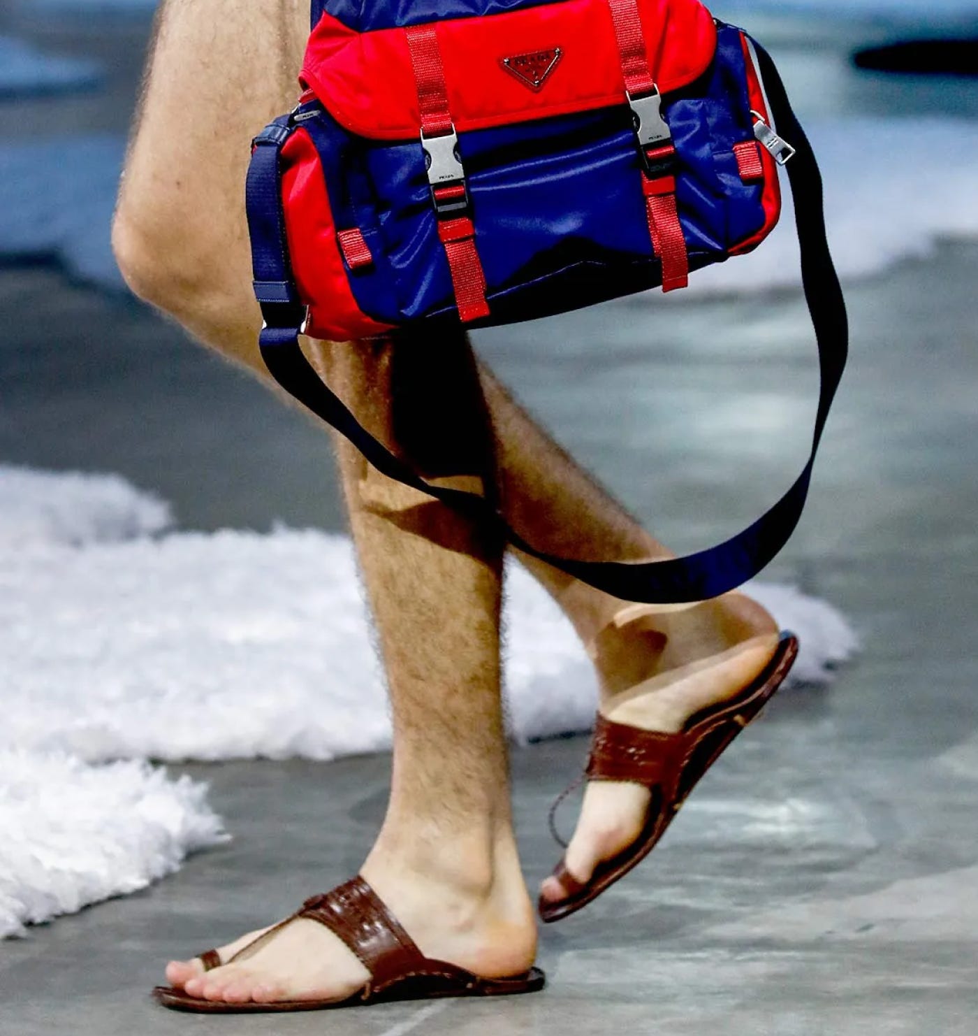
Prada hadn't acknowledged the reference. What followed was the loud, familiar conversation about credit and cultural ownership. But underneath that conversation, something else was happening. A country that has watched its design heritage get borrowed for decades without attribution is now paying very close attention. Louder than the outrage was the pride, and the appreciation for what we have (and what we’ve had all along).
All this to say, the Indian consumer has moved on. 36% now prefer local beauty brands over imported ones, compared to 23% who prefer imports. That is a reversal of the aspiration hierarchy that ran this market for thirty years. The consumer who once used foreign provenance as a shorthand for quality is now reading ingredient lists, demanding scientific evidence, and increasingly choosing to spend money on something built here. The deference is fading. The brands just need to believe it too.
My Take
India’s beauty industry is being watched right now, by global houses, by investors, by a generation of consumers who are, for the first time, genuinely curious about what comes from here. BeautyMatter called it a generational shift. Industry analysts are talking about I-beauty as an emerging export philosophy. The moment is real, and it will not wait.
India has 1.4 billion people, more than 120 languages, and a visual culture of staggering range and depth that most of the world hasn’t even begun to understand. And a generation of founders and creators building with full awareness of all of it. That is not a small thing to build from. Qaafi understands this, and is building like it does.
Whether that scales into a lasting business is still an open question. It is always an open question at this stage. But the fact that it asked the right question at all, clearly and without apology, is already more than most brands in this category have managed. Bas qaafi.
Fatema signing off - if you appreciate brands like Project Qaafi, follow ChaiSociety on Instagram to enjoy a design-led curation of homegrown Indian products and brands just like it. And if you want more on brand and design, subscribe to Layer by Layer, my weekly newsletter.
Lastly and most importantly, a genuine thank you to Rahul Sanghi for patiently holding my hand through every edit of this piece.
Any other references / links?
Project Qaafi — Official Website
The Nod Mag — Project Qaafi’s founder is trying to build the next Aesop out of India
Robb Report India — Aahan Chatterjee’s Beauty Brand Project Qaafi Doesn’t Slip into Cliches
Homegrown — Inside a Homegrown Beauty Brand That’s ‘Qaafi’ Original
Blur The Border — Project Qaafi
If you enjoyed this post from Next Up India, you might like our other India-focused media brands too. Learn more about the coolest things happening in the Indian startup ecosystem at Tigerfeathers and Runtime BRT.
And if you want to contribute one of these yourself or shout out a product you loved, get in touch and get involved🫡
 | A guest post by
|
A sword?! It comes with a SWORD?! Alright, picking up a tube of Qaafi as soon as I'm in Mumbai. I'm sold. Lovely piece Fatema.
I was deeply impressed by my first (unplanned) Subko Cacao experience recently, and have been searching for products with a similar level of intentionality and Indian boldness (not apsaras in a forest or babas under a tree). Can't wait to try this out.
I simply love the way you write Fatema maam . You have made products protagonists and I'm here for it